
…to be a one at all, you must be a many and it’s not a metaphor.—Donna Haraway (2014).
I am not going to act like I fully comprehend the work of Donna Haraway. But I do revisit her Cyborg Manifesto every few years and try to wrap my head around it. Each time is a challenge where I come away feeling I might understand it a bit better, like a decades-long riddle. What is clear in her work, though, is that we have agency through our relationships with nature and machines to “not be Man.” Or in her most recent work, to regenerate from the waste of late capitalism, like compost, into something different, something where identities are not separate from animals and machines but also not quite holistically bound together in a hippie-dippy earth-mother sort of way. As she famously ends her manifesto: “I would rather be a cyborg than a goddess.” There is room for infinite difference in our digital, cyborg future, where identity expands beyond a patriarchal late capitalism defined by clear objectivities measured in subjective binaries. The way in which we manipulate data through our digital prosthetics offers a rhetorical frontier never before imagined.
Now you might be thinking, what the heck does this have to do with wheat and digital humanities? Well, while reading Catherine D’Ignazio and Lauren Klein’s chapter in Data Feminism on data visualization and objectivity, I was reminded of the data visualizations I often come across in US food and agricultural historical documents. D’Ignzazio and Klein explain how “objective” data visualization simply provides information in an easy-to-consume fashion. Arguing from Haraway’s concept of situated knowledge, such an assumption relies upon a false dichotomy which is gendered. It is generally accepted that data visualization should not be emotional. It should just relay the facts in a reasoned manner, in a masculine way (as if men are not emotional and women are always irrational).

The authors point to the data visualizations of W.E.B. Dubois as an example of powerful data rhetoric. His “data portraits” (shown here from a Smithsonian article) of the Black experience in the United States for the Paris Exposition in 1900 are an example of not just deft pieces of rhetoric standing in opposition to the white supremacy of knowledge but also proto-avant garde artwork. Rhetorical visualization of data was a widespread tactic among social scientists of the time, not only used as tools to show inequality by social scientists but also by government agencies to reinforce American ideals such as agrarian exceptionalism.
The third principle in the Data Feminism book is to dissolve such binaries and embrace emotion and embodiment. Thus, visualizations should persuade beyond sterile data points. They should do more than transmit information, they should persuade as a form of rhetoric. This is not a new concept in the world of data visualization, although the objective is not always one of liberation.

Take the wheat production and exportation visualization above from the 1885 report of the Commissioner of Agriculture. No other commodity has such an artistically-rendered graph in the report. The statistician engaged in what Haraway calls the “god trick” of zooming out to a generalization while invoking the specific. The agrarian-themed scene suggests the particularity of individual farms while integrating the general data to which the farm contributes. Wheat prices were at the forefront of American agricultural consciousness as they were tied to global competition. 1885 was a record-low year for US farmers.
The above graphic’s small sack of wheat sits next to a scrubby tree. It is juxtaposed with the larger bag and a neat sheaf of wheat from the most recent half-decade. A letter from a statistician accompanies the graphic stating that the “countries of high civilization” with “progressive agriculture” such as the United States will continue increasing production in light of the recent setbacks, assuaging the fears of the western farmer. The farmer is eased into the graphic on the overleaf which gives a much less emotional presentation of the actual situation:
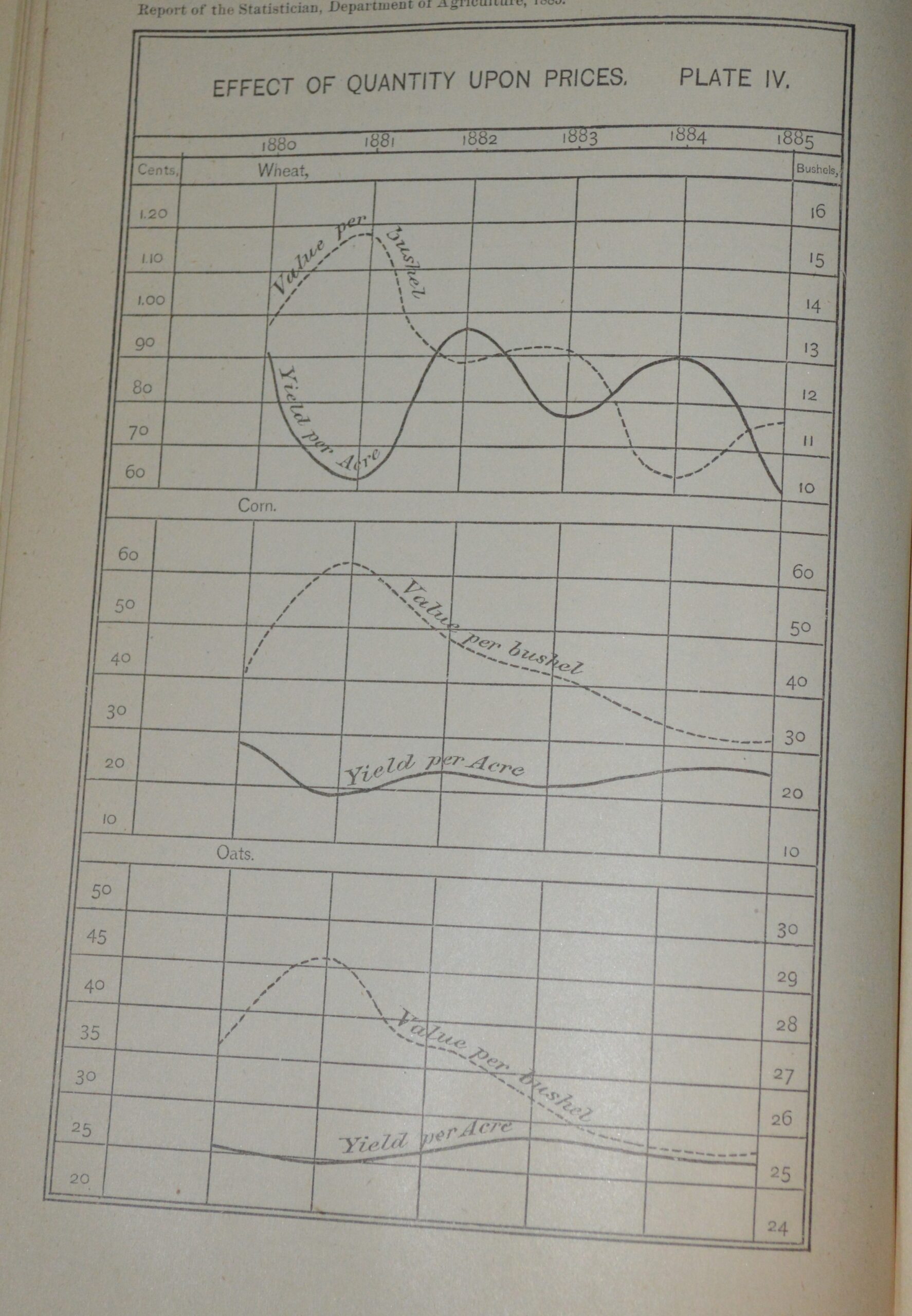
Yet, the graphic is not void of emotion. By placing the wheat next to the corn and oats, the researcher has created what D’Ignzazio and Klein call visceral uncertainty. Unlike other commodities, supply and demand was affected by global production and the uncertainty of prices is embodied in the criss-crossing lines, which influences the decision of the farmer (do I gamble with wheat?).
The head statistician for the Secretary of agriculture at the time, J.R. Dodge, told the New Orleans Cotton convention that the best method for conveying statistics is the “graphic method” and his work was created so someone could run through an exhibition and “read intelligently as he runs.” It is highly unlikely, though, that Mr. Dodge was solely responsible for the eighty pages of text, charts, tables, and illustrations in his government reports (and that there were not also not southern women interested in cotton production). It begs the question: Who drew these charts? The invisible labor in the data supply chain has not gone away.
Like the unknown workers in the stats department of USDA in the 19th Century, Catherine D’Ignazio and Lauren Klein show how the invisible workers behind the current data world consistently are women, a high percentage women of color. They tend to also be relegated as second-class employees, such as the people scanning our Google books who do not have equal access to the campus.
We live in a time where the tools are available to create a world where data can be used to quickly get information to (and about) a lot of people at once. The way that information gets to people is important. The way data is organized and interpreted is ethical. Do we just try to send it out without any subjective attachment, without any emotion? Of course, this is impossible. In fact, it is becoming more impossible as we integrate into the digital world. Subjectivity and objectivity blur in our new metaverse where we become avatars (How many of us have had a conversation or meeting with a photo over the last year?).
In our discussion last week the concept of metaphors for Digital Humanities were discussed. I like the idea of the feminist cyborg. The paradox of humanity and digital is too large to ignore and we are all a one of many now, whether close-reading Luddites like me like it or not.
[P.S. I was going to explore the idea of data models. I once managed a database by the seat of my pants with little existing knowledge amongst fellow employees who were creating data that, in the words of Julia Flanders and Fotis Jannidis, made “sense in their head,” usually as color-coded spreadsheets or lists on word documents. I am no expert on data computing, but I learned quickly the importance of formal models. It just didn’t fit here. Maybe next time.]
Pingback: Space, Time, and People – Jayson Otto