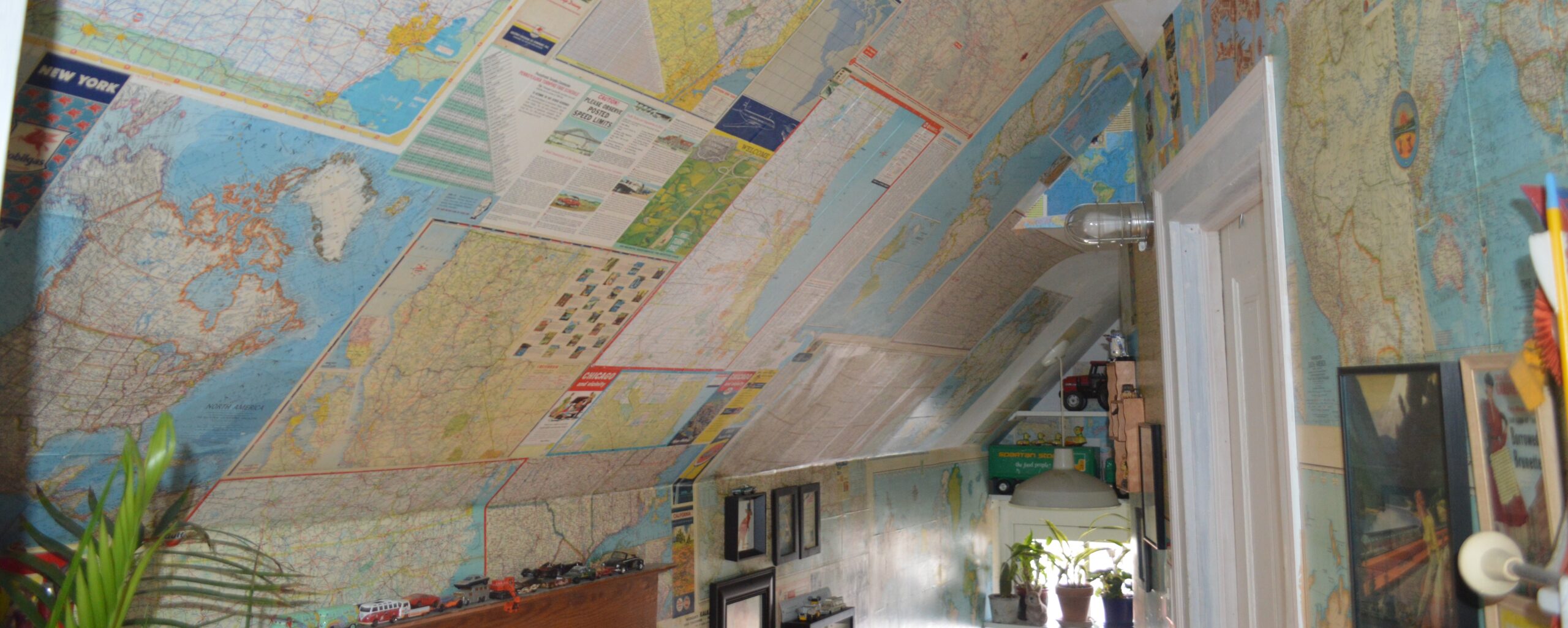
This is a picture of our hallway. As you can see, we are a house of map lovers. When I was a kid I used to stare at maps and globes for hours imagining trips to all the points (who am I kidding I still do this). We still don’t use GPS when we travel. There is something about seeing where you are on a paper map and scanning across the page imagining where you can go. Yet, maps don’t just tap into the little romantic explorers in our subconscious, they are an incredible tool for learning and research and making them has become ridiculously easy. Now, finding the data to build the map that may answer your question? That is a bit trickier.
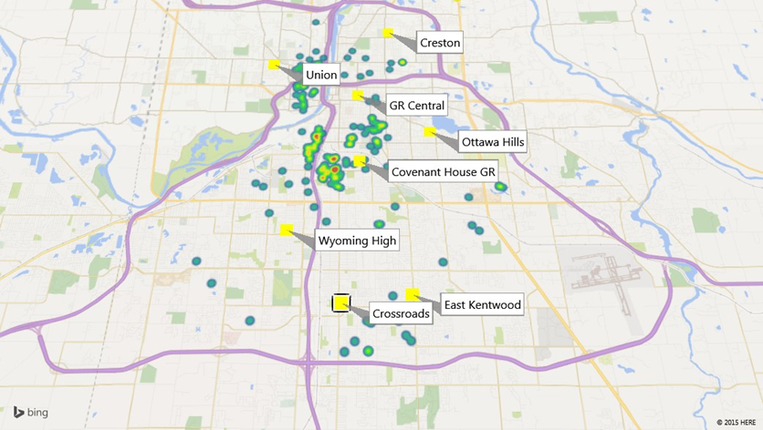
This week was much less frustrating than last, partly because I want to get this mapping thing down so I can try and map some urban food environments from the Progressive Era in Michigan. The last time I attempted mapping data was about five years ago when asked to present a feasibility report to the board of the charter school district I was working for. I used an Excel Google Maps plugin and this is one of the maps I ended up making which shows the concentration of households for English as second language students attending Covenant House Grand Rapids in relation to Grand Rapids’ high schools:
I thought this map was pretty nifty as it provided the board with quick information, but it took some time to put it together. This week, once I figured out the interface on Flourish, I was able to throw this map together from the data our professors gave us in a just few minutes. Click around and you will find more data:


To learn the Flourish interface I just jumped in with my own data and made a simple narrative map of the historical marketplaces in Grand Rapids (see below). I found that Flourish would probably have the most potential of the three platforms we looked at since it works decent for narrative maps and for data maps. What I really want to do, though, is make an interactive map of grocery stores, marketplaces, and public gardens (probably school and community gardens) in Grand Rapids in relation to the demographics of neighborhoods over time between 1895 and 1925. Historical census data, let alone mapping data (of which much is found here) does not usually disaggregate to the city level, let alone neighborhood level. However, there may be other ways to get an idea of neighborhood makeup.
The Survey, one of the leading social work journals of the Progressive Era, published this map showing how old saloons were reused during prohibition. What is really fascinating about this map, though, is that they marked out the racial and ethnic makeup of the neighborhoods. Maps are reflections of power and how space is made into subjective reality, and it is interesting how social workers thought it would be important to show where immigrants and African Americans lived in relation to saloons.

I would like to use this map as a layer for my maps so I went over to MapWarper and rectified it. It is amazing how quickly I was able to do this. I once rectified a map “by hand” years ago in Microsoft Publisher. It worked fine for a visualization for a presentation where I physically put points on the map. Now I was able to upload my map, pick some reference points, and then download the data to use in mapping software. I planned to try out Neatline with this data but am having trouble getting the API to work properly, so that will have to be saved for later.

I feel I made some good progress this week toward thinking about what kinds of maps would be the most useful to generate and answer questions in my own work and offer others the opportunity to think about Grand Rapids history in novel ways. A narrative map is great, but I would love to make an interactive historical data map like that produced by Tim Hitchcock and his team. Locating London’s Past is an incredible example of the power at our fingertips without having to be well-versed in complex coding. Users can go right in and choose data which shows up on rectified maps of London. Such tools can get us thinking about, in the words of Hitchcock, “landscapes and cityscapes [that] only exist between the ears of their denizens.” We cannot know what is going on inside the heads of the people we study, but we can begin constructing an idea of how they imagined space by distant reading newspapers and mapping place words, giving spatial context to narratives, or spatially presenting historical data. I hope to be able to bring together the narrative map and data map. We’ll see. It would be a project that, where as Todd Presner and David Shepard show in their brief overview of geospatial humanities, the disciplines of urban planning and would come together with history to uncover valuable information which could help inform future communities.
Well, as you can see I did not make my Saturday deadline again. I got pretty caught up in mucking around with maps since this is an area I plan to pursue in my own research. Next week I will be looking deeper into visualization and hopefully it will build on what I started this week.